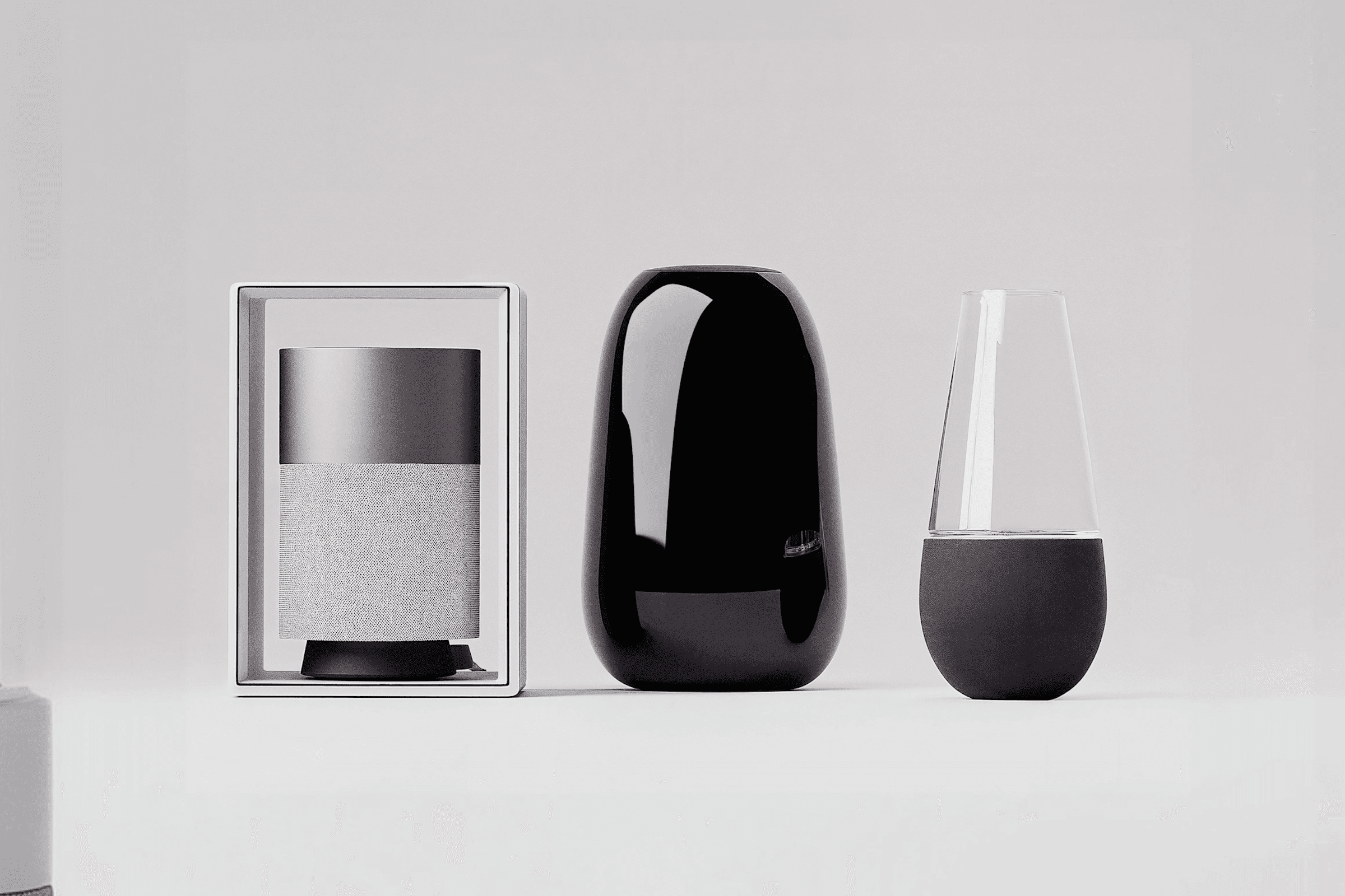
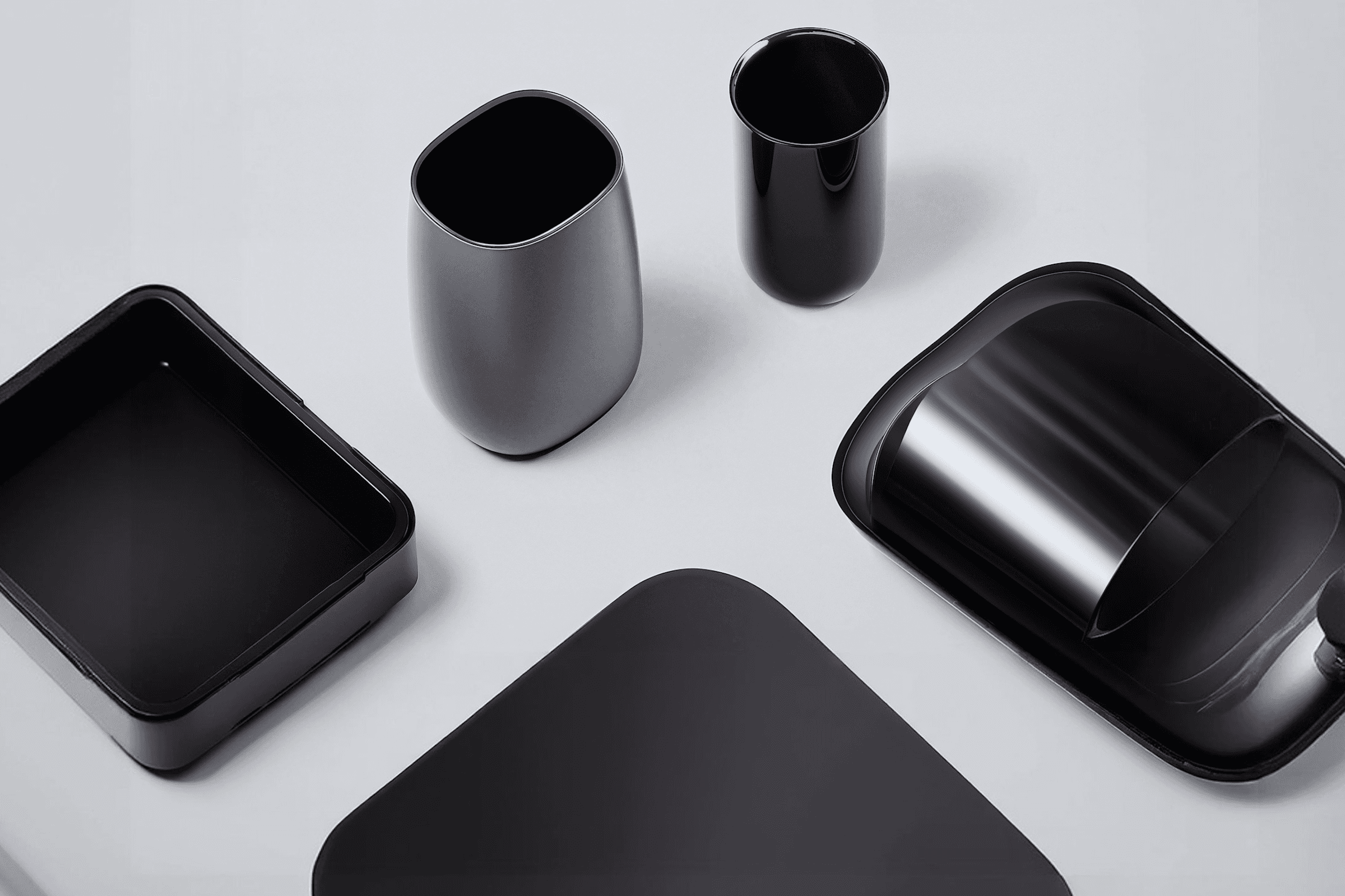
Ana & Co. is a studio known for brutalist interiors and raw materials. They needed an identity that felt as permanent and substantial as the architecture they create, requiring us to bridge the gap between heavy, static forms and sophisticated, livable design.
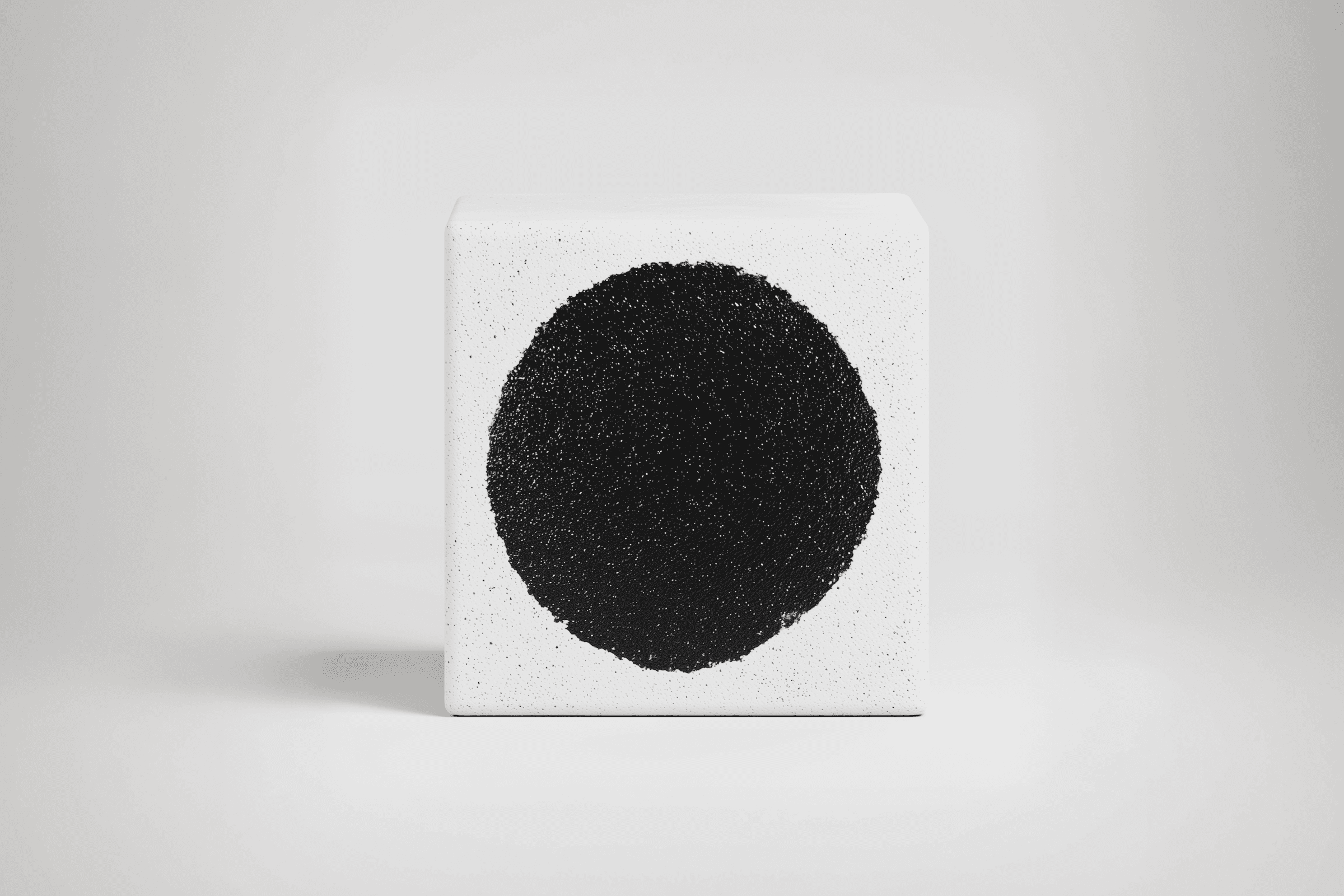
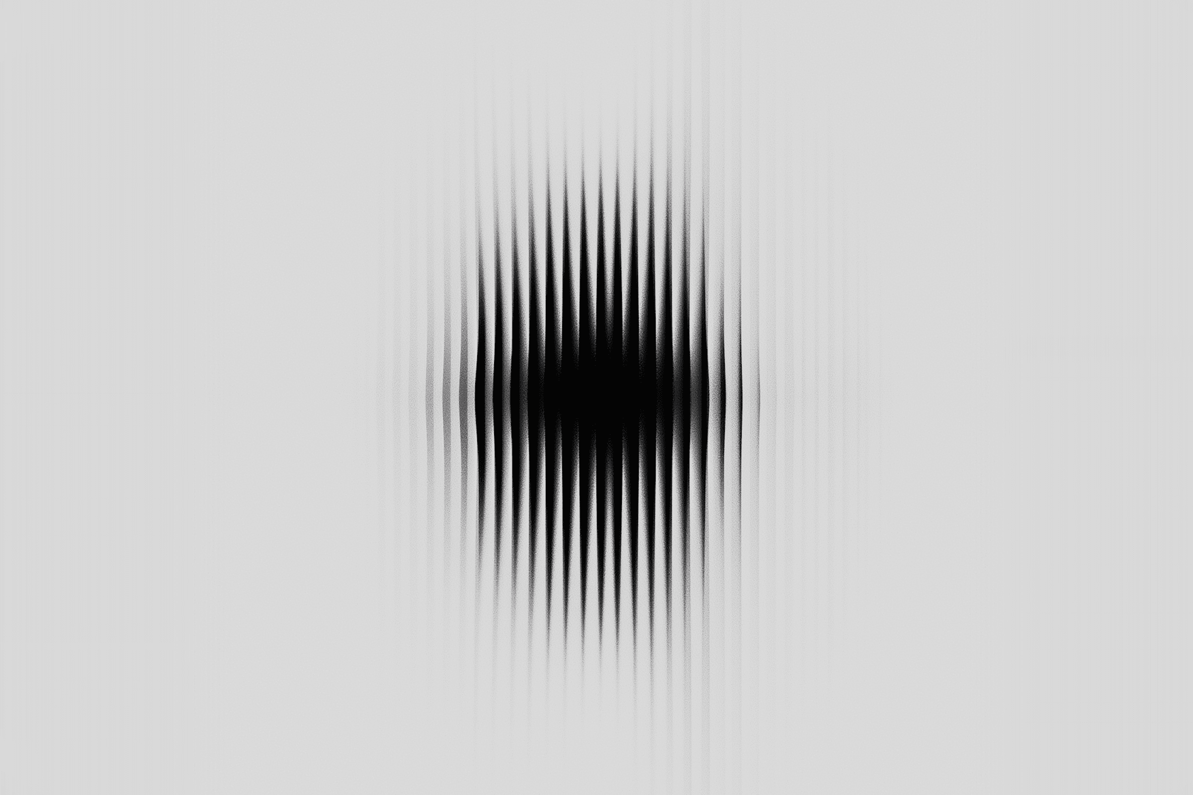
The entire concept rests on "The Center of Gravity." In both design and business, stability is everything. We sought to visualize where raw meets singular intention.
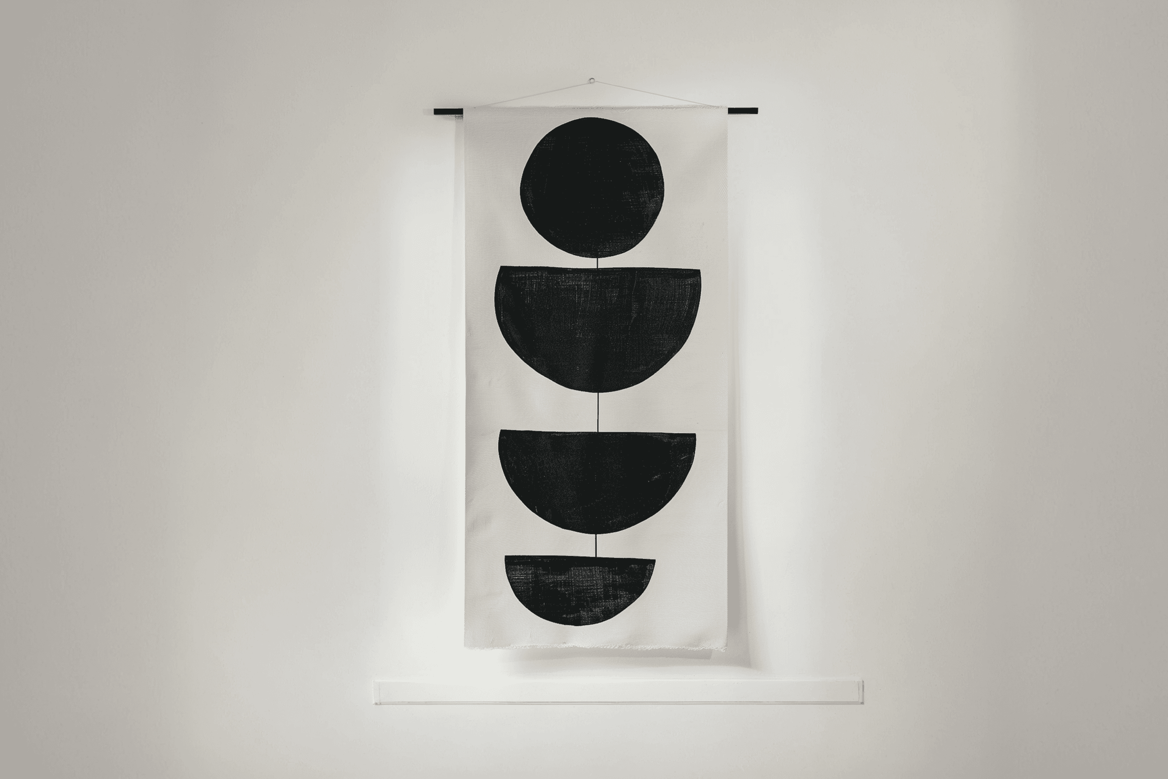
True luxury is not defined by decoration; it is measured by the presence of silence and the absence of clutter. Structure, to us, is more than just physics; it is a visual language of trust.
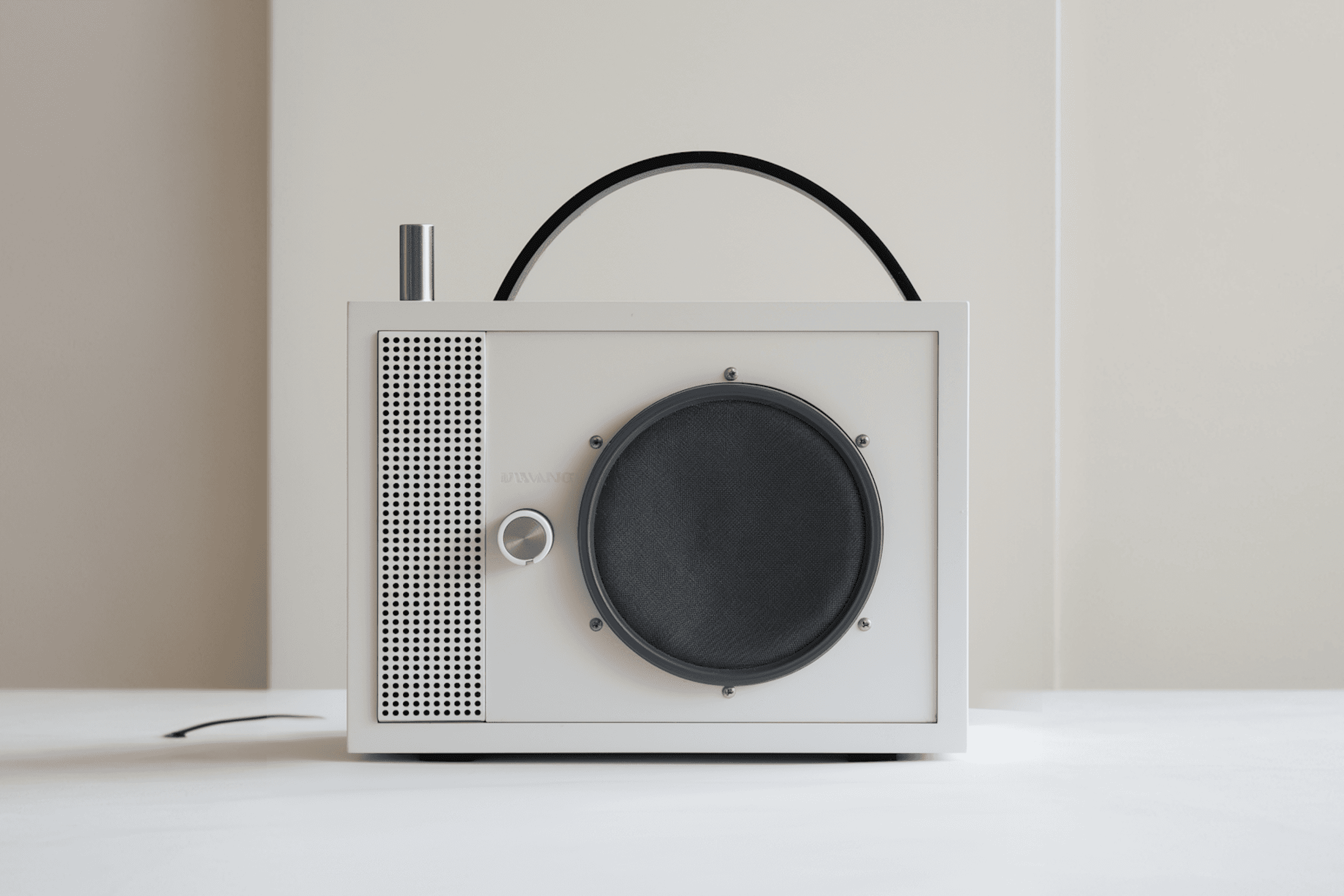
We stripped the identity back to its elemental forms: stone and void. The visual system utilizes heavy, textured typography paired with intentional negative space, mimicking the experience of walking through an Ana & Co. building.
The logo mark a perfect circle on raw concrete symbolizes the singular focus required to turn stone into home.
We positioned Ana & Co. as an honest, architectural voice. The identity commands attention through sheer presence and material weight, successfully creating a brand that doesn't chase trends.