Clover Studio builds the complex digital backends that power the world's biggest applications. They are the hidden architects of the internet. They required a brand identity that celebrated the engineering that usually remains invisible.
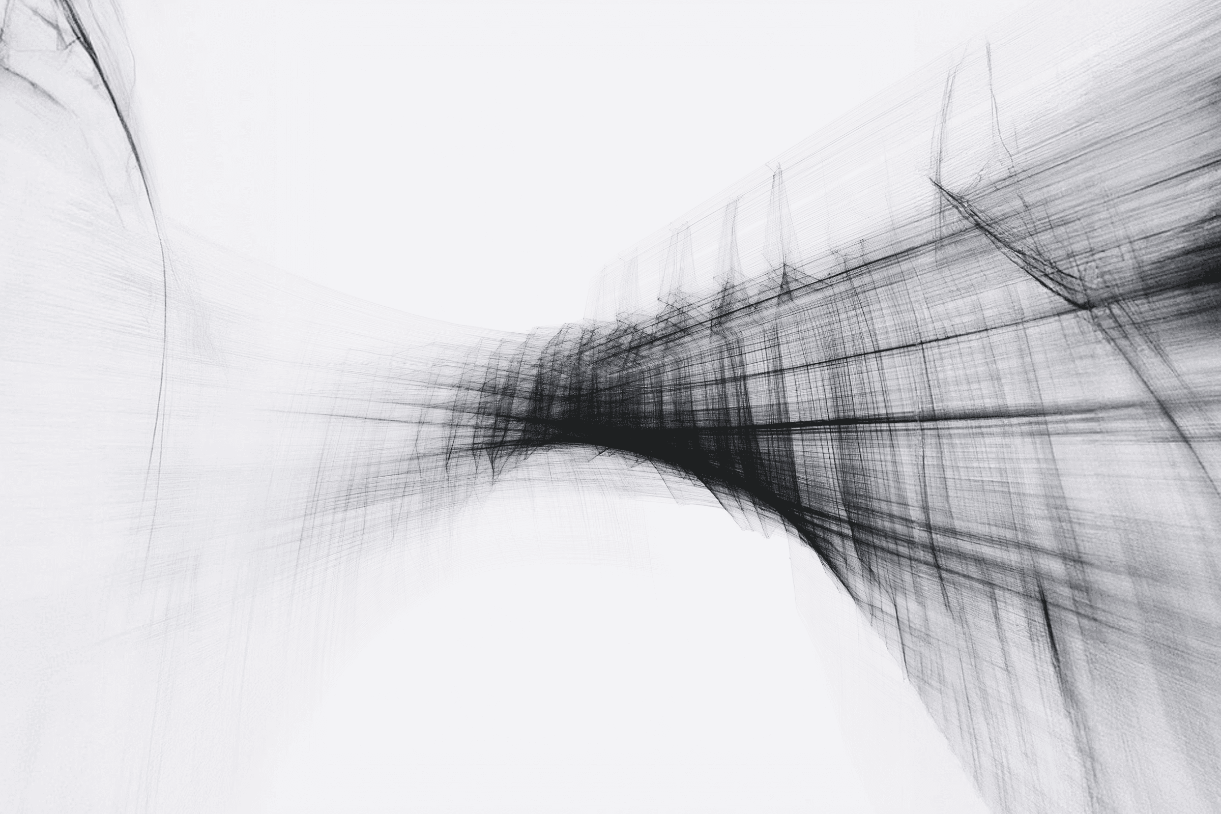
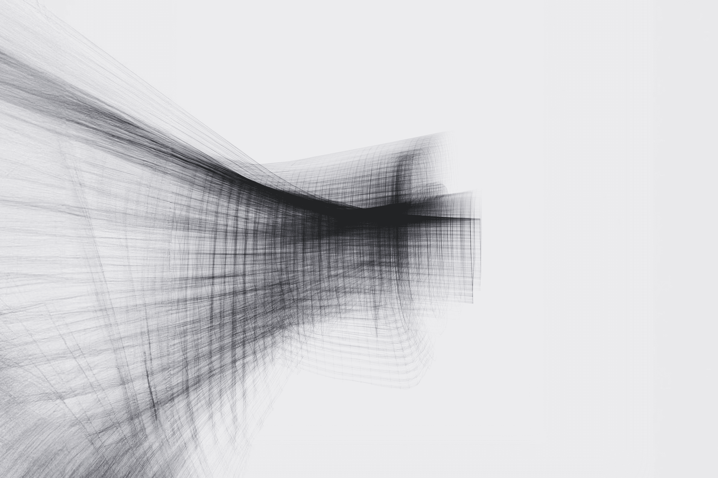
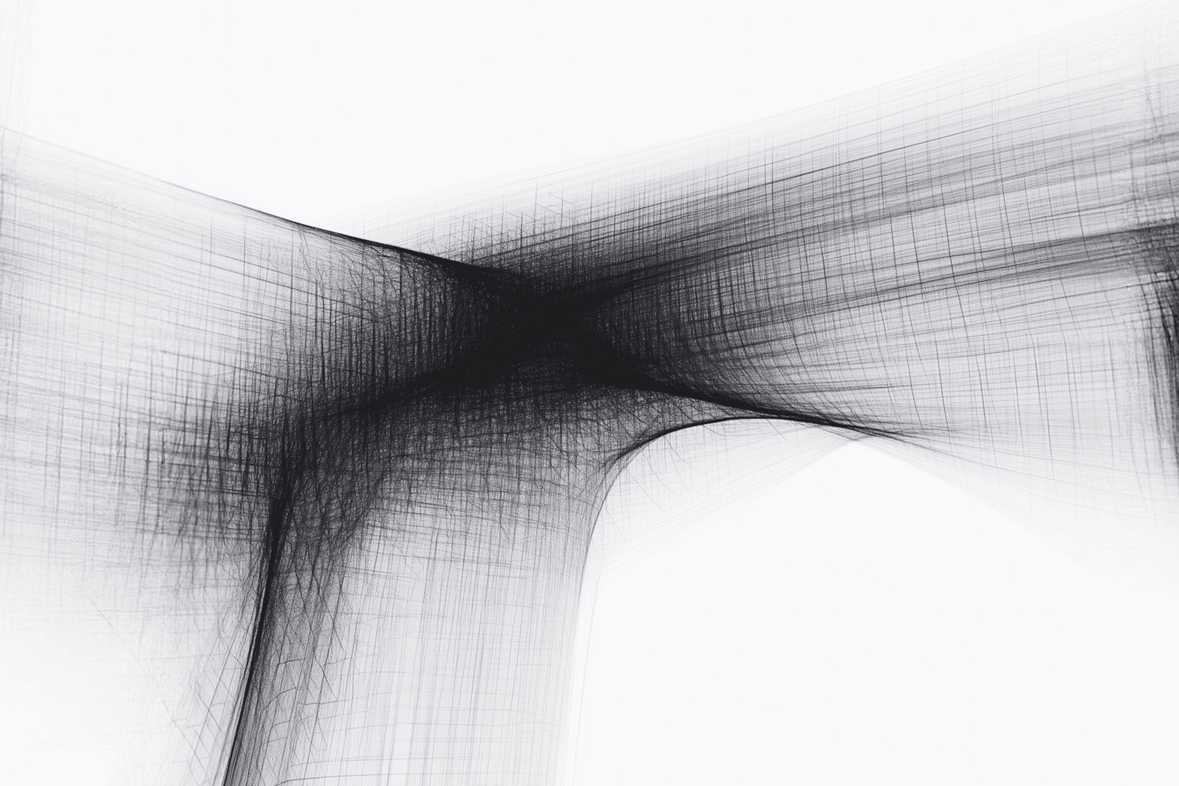
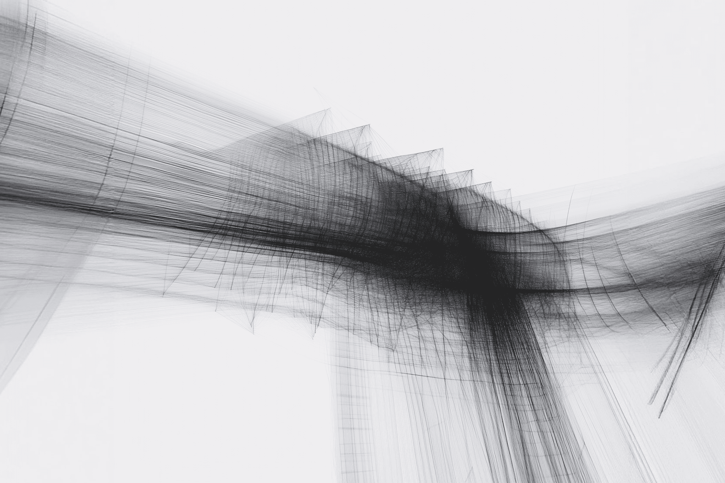
We wanted to invert the usual design process by showcasing the wireframe not as a functional draft, but as the finished piece of art.
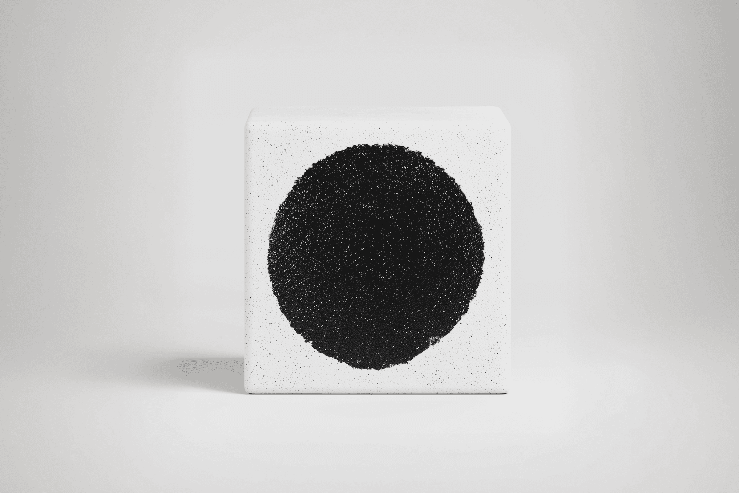
Beauty is not merely the skin of the design; it is found in the bone structure beneath. We champion radical transparency, believing that a brand's value is proven by showing the integrity of the beams, the bolts, and the precise logic that holds its entire system together.
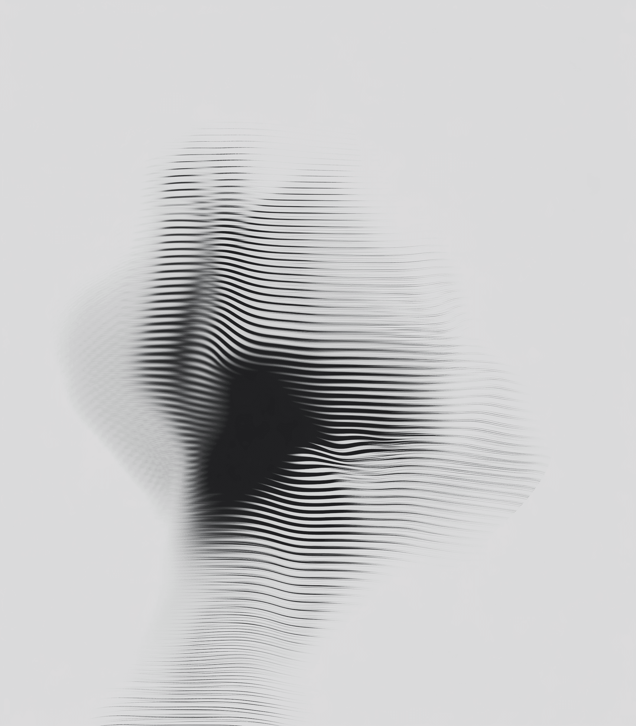
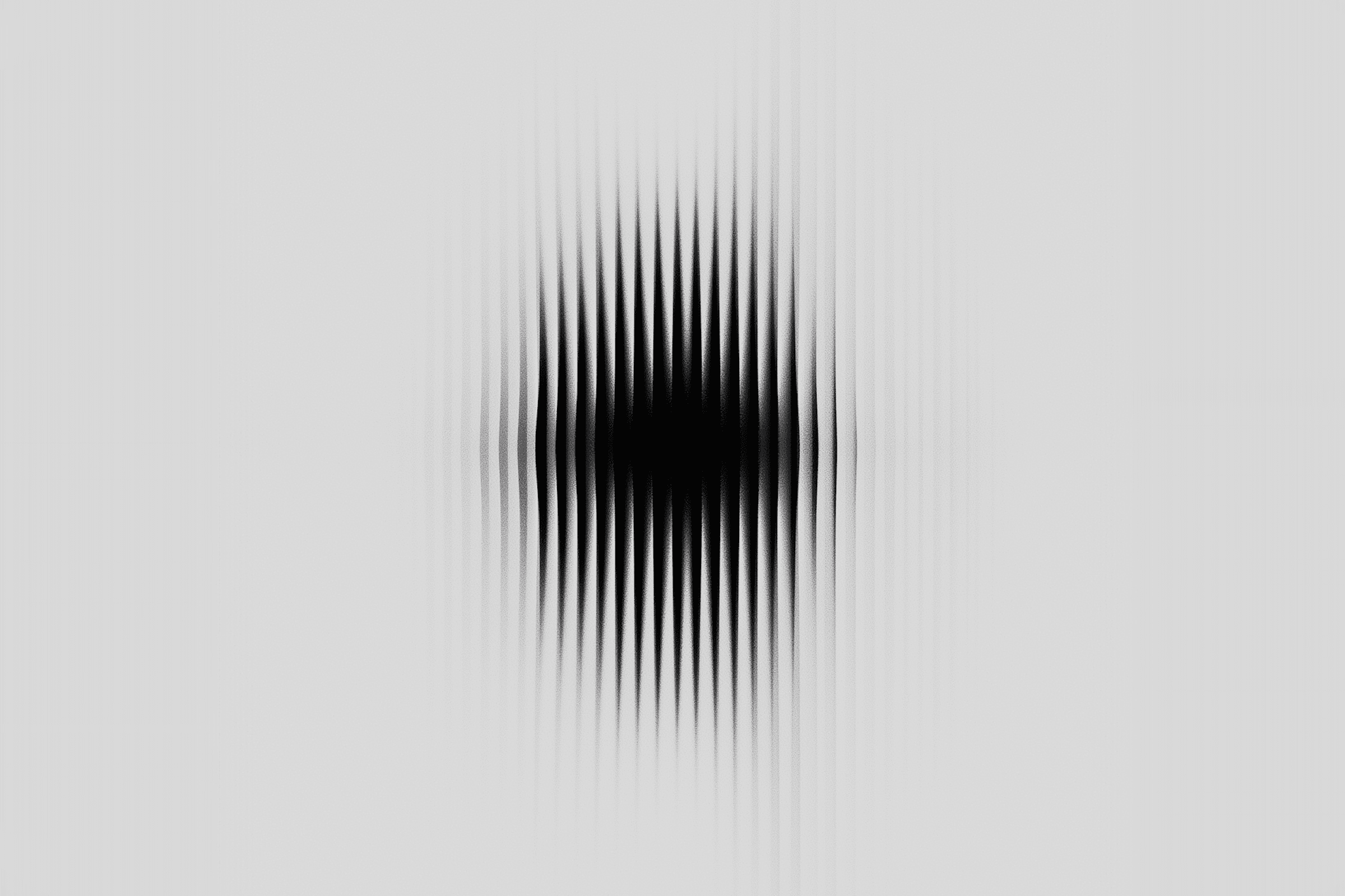
We developed a visual system based on topographical meshes, architectural lines, and controlled glitch art. The imagery suggests a digital landscape being meticulously constructed in real-time.
The typography is monospaced, referencing the terminal, but set in high-contrast editorial layouts to bridge the gap between developer and designer.
By elevating the wireframe to high art, we positioned Clover Studio not as service providers, but as digital artisans and engineers. The rebrand validated the complexity of their work, attracting a higher tier of enterprise clients seeking structural integrity.